 iRiver is known for making great portable DAPs and PMPs. So everyone got somewhat curios when they entered the eBook reader market. Their sole reader — the iRiver Story has been out of reach for most of the west because it has not been selling anywhere in the US. That has not changed but it has gotten some hands on time at The Register.
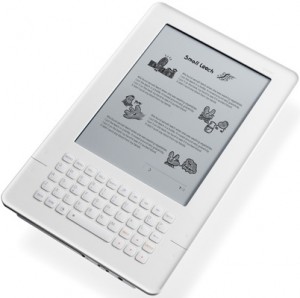
The Story actually does look like a distant Kindle cousin but the reviewer assures us that it is only skin deep. It looks similar on the outside because it has a full QWERTY keypad and the same white color. But that is where the similarities end.
The keypad actually encapsulates all the main controls on the device. As was apparent from the images, all the main controls sit above the keys and four directional keys are integrated within the keypad. So at a glance it might seem like it has dedicated controls missing. The well integrated set up makes for a really nice façade if nothing else.
The keypad looks really nice and it apparently is very comfortable too. It supports PDFs, EPUBS and a host of other formats that include office files like word, powerpoint, excel, etc. That is nice and impressive. But if you want to have full functionality, you will have to upgrade to the latest firmware.
A main area where it loses out to the Kindle is the lack of built-in wireless. This means you will be tied down each time you want to do something online. Plus the bookmarking system is a slightly complicated series of button presses. One great thing about the menu system is that it thankfully bypasses tedious page refreshes every time to access a sub-menu or a new one.
Overall, it is a good eBook reader though.
When, when, WHEN will these manufacturers learn that you do not put an E-Ink screen in a white case? Have they learned nothing from decades of psychology research?
Reflective screens look best with a dark bezel. Period. Put them in a bright white case, and the screen will ALWAYS look muddy gray.
I’m sure they did plenty of psychological research. I’m guessing these were their findings:
White = Apple. Apple = cool.
They might have chosen white so that the ereader looks like an actual book when you put it a the dark leather case/cover. I agree with the poster that said that a dark device would give better contrast.