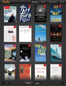
While customers have barely had time to wipe the first set of fingerprints off their brand new iPad 3 purchases, Amazon has prepared to take advantage of the improved screen quality that the device incorporates by updating their Kindle reading application. Users will find their reading experience in this release, Version 3.0, noticeably crisper, cleaner, and with a couple useful new features. Magazines and other publications that choose to use high resolution color imagery will be right at home on the platform now, thanks to these changes.
 There is now a tab available at the bottom of the screen, clearly borrowed from the Kindle Fire’s native interface, which allows easy switching between locally stored and cloud based books currently available to the account. This should make it easier to manage content on the most basic level. Things are also displayed in the same grid view that the Kindle Fire interface relies on for eBook navigation. In terms of the general reading experience the update is a step forward and does good things for new iPad 3 owners.
That is not to say that there are no complaints about the new release, of course. While they made no real note of the alterations to the way the app works, a few useful features were quietly removed. Customers have been complaining, for example, that the ability to search from the dictionary to Wikipedia and Google has been removed since Version 2.9 of the app. This seems to be a very strange change given the potential usefulness of this feature and the seeming lack of effort that would have been required to maintain it once developed. It certainly has nothing to do with bringing the Kindle for iPad experience in line with the Kindle Fire, as the Fire still has this ability. There is also still no ability to organize one’s library via the app itself, as well as no folder or tag system. While this is true of everybody using anything Kindle related besides the eReaders themselves, which at least have the Collections system, it remains a source of frustration.
Overall the consensus is that this brought the new iPad a superior aesthetic experience compared to what is available elsewhere, but that it failed to improve functionality in any major way. Perhaps this is to be expected, given that with the need for a completely external iOS Kindle Store there must be little pressure to release innovations on that platform first, but it does lessen some of the enthusiasm for the first real app update to bring readers the advantages of the iPad’s improvements.
Realistically, especially with the second Kindle Fire release expected right around the corner, any major improvements along the lines of function will probably come through their Kindle for Android or Kindle Cloud Reader options first. The stylistic changes that bring the Kindle for iOS app closer to the Kindle Fire’s appearance only serve to highlight how important it is for Amazon to unify their platform. In the end we can probably expect to see any major changes radiating out from Kindle Fire updates except when, as in this case, those changes are to take advantage of hardware capabilities that the Kindle Fire simply lacks.