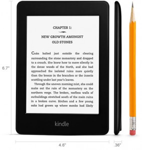
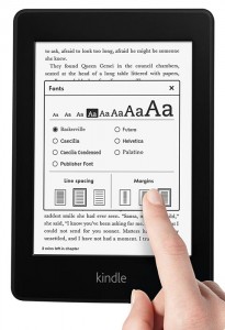
 The Kindle Paperwhite has finally shipped out and reactions are coming in quite rapidly. While there are many customers who will be unable to get their orders until later this month due to the overwhelming demand for the new Kindle, it’s clear that the eReader side of Kindle products is hardly a thing of the past.
Since this was essentially Amazon’s big move to catch up with Barnes & Noble when it comes to front-lit eReading, it was somewhat difficult to see how things would go. Once you’ve established a way to light up the screen without major problems or backlighting you’re basically set. It turns out that I wasn’t the only one wondering and some of the reviews that have gone up so far make the comparison explicit:
“I cannot emphasize enough how brilliant the screen is and encourage you to find a display model to look at if you’re on the fence about it. I’ve used the Nook Simple Touch with Glowlight and the Paperwhite display blows it out of the water.” – Scott
That isn’t to say that there are no problems. While the majority of users report a nearly perfect experience with the lighting so far, some of these Kindles appear to be flawed:
“After all the raves about how invisible the LED light sources were, it was disappointing to spot them immediately out of the box at the bottom of screen. And then, as others have noted, the lower screen is also marred by shadowy areas between the LEDs that might be described as smudges or banding. This was definitely NOT the beautifully even glow of light across the screen that Amazon product photos have shown and which I was expecting.” – charlesn
If you have a similar experience, I strongly recommend getting in touch with Amazon’s customer service. While it is possible that these flaws fall within acceptable ranges as far as the production is concerned, Amazon has spent a lot of time talking up the evenness of their new lighting and is likely to replace as needed should the problem on a particular unit be unusually bad.
In terms of general screen quality, the consensus seems to be that the blacks are blacker, whites are whiter, and everything is both crisper and faster. Not unexpected to be hearing such things, but it doesn’t hurt to get some confirmation that this is a noticeable improvement for most people over the E Ink Pearl display that has been the standard for some time now.
The lack of speakers has not gone unnoticed (and who really thought it would be?) but it hasn’t come up much so far as a major problem. Those reviewers who comment on it at all, however, are quite unhappy:
“The Paperwhite has no sound whatsoever. That means no text-to-speech, no blind-accessible menu options, no playing your audiobooks from Audible. I am incredibly disappointed that these features have been gutted” – Joan
 It’s likely that Amazon is making an effort to get their accessibility features set up on the Kindle Fire in order to take advantage of the more powerful device’s ability to handle such things. Does that excuse removing these standard features after once having tried to define the whole eReader line with things like Read-to-Me? Nope. The decision might make sense in some ways, but it’s not a good thing for customers.
Fortunately for Kindle fans, since that particular feature removal is unlikely to be reconsidered any time soon, there are enough positive impressions to indicate that an upgrade is worth the money.
Things like the progress bar enhancement seem to be going over really well, for example. It’s gotten an overall better response, based on these first couple days’ worth of impressions, than X-Ray did when the Kindle Touch was announced:
“My favorite new feature is the “Time Left” calculation at the bottom left of the page. While you are reading, the Kindle calculates how long it will take you to finish the book or the current chapter based on the speed with which you have been turning pages. You just touch the bottom left of the page to toggle the different selections (also shows which location you are on).” – R. Toro “Tech Junkie”
The only real software-based complaints, in fact, seem to center around the inclusion of book recommendations on Kindle Paperwhite models with the Special Offers disabled. Despite the toggle being off, only paid advertising is removed. This means that book recommendations are still showing up on the home screen. For some people that will be a valuable asset while others will find it obnoxious. Personal preference will be the deciding factor since it’s a relatively unintrusive feature, but excluding that from the advertising opt-out on the Kindle Paperwhite is somehow more obnoxious than the similar recommendation section on the Kindle Fire HD. Possibly just because the Kindle Fires cover a wider range of content and can genuinely offer you something you might not have thought of while the book recommendations are unlikely to surprise and impress with any regularity.
All told, I have yet to find a review on Amazon or any other site that claims the Kindle Paperwhite is second-best compared to the competing Nook Simple Touch w/ Glowlight. That puts Amazon back on top in terms of hardware again. Since they already had the best content selection, that’s going to be a huge advantage when it comes to holiday sales.
Is this upgrade enough to be worth buying a new Kindle if you already own an eReader? For once, it just might be. While E Ink screens have largely offered fairly small changes from generation to generation, the Paperwhite is the most extreme improvement we’ve seen since the first Kindle and the front-lit reading capabilities are amazing. Assuming that there is an interest, it’s hard to argue against this upgrade.