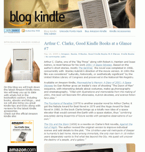
Unless this is your first visit to BlogKindle.com, you probably noticed that website looks quite different. I was planning it for quite some time and finally did it. I’m looking for your honest opinion. Did I make BlogKindle better or worse. Please vote! Below is the screenshot of how it used to look before…

Definitely improved. I just hope I can find the “contact us” link, finally. :)
-JRS
There is no such link :)
However either writing a comment or mailing to contact {at} blogkindle {dot} com is known to work quite well :)
The content is always great here.
On the new design, those (like me) with 1024 x 768 displays can view it all only if we maximize the screen blocking out anything else we have that we might like to keep just a bit seeable behind the main screen. My stats for the mainly text sites show that most people are still 1024 or under. But if a site is image-heavy it’s always larger screen displays that are the ones there. Sort of self-selected. In the right column nothing wraps. Normally that’s done with tables, easily, but I think maybe it’s become old-fashioned and frowned on to use tables. But there’s no way to have the basic portion wrappable for screen size?
I worked for years at a University until 2 yrs ago and they did not update most of the displays due to not enough funding. As a result you wouldn’t believe the screens set at 800×600. Those would have problems viewing it.
I didn’t find out until I went to several departments to try out a page of mine.
The image of the Kindle with the blog showing is distracting because it’s in the middle of text.
I really like the organization of everything.
– Andrys
get rid of the background image and it would be fine.
Well, for me, the background image is fine. I’m just getting a little epileptic looking at all the flashing ads…
My favorite touch is the background image–viewing the blog on the Kindle on the blog is SO meta. :)
You may want to rethink your logo, lest you get a call from Amazon’s legal department.
Just checked my stats. 15% of visitors have 1024×768. Lower resultions are just under 1%. I actually assumed that this width would be ok for 1024.
When I’ll do v3 design it’ll have photo of kindle with blogkindle.com design v2 with this v1 design image as background :)
New design is OK, but background image make reading your blog quite painful
I agree with Andrys. On my computer, I keep the browser window in a “portrait” perspective and not “landscape”. I prefer for the websites I visit to reflow nicely to the width that I choose and not to force me to scroll sideways to see the entire content.
So, with your site, each time I change pages, I scroll over to the right. Your right-most column fills about 90% of the browser width. That means that I’m rarely going to see anything you put in your left column. And, if that’s advertising, you’ve lost an opportunity for a click-thru.
Why not make it 900 pixels wide? These screen size stats are self-selecting when you look at stats.
It’s like the photosites. Only people who can wait long enough or whose screens are large enough can deal with having to scroll or maximize, showing nothing else on their pc’s. What happens is they go away and then the webmasters say only people with larger screens are accessing it.
But your page is fast-loading. It’s only that at 1024 it fills every inch of my 17″ and, no, I don’t want to buy another screen as it’s clear and the colors are great. Most sites do wrap the text if the user wants to narrow the screen so s/he can look at other things at the same time.
However, it’s workable, but since you asked I said.
That background image really is ultra distracting and it makes some text more readable than the rest of it. It just sort of takes your consciousness and gets it focused on this area that’s dark and changes text areas.
Why not make it lighter, or less strong a presence?
I like it better than the old — at least it doesn’t have images of the hideous fugly Kindle 1 on it. :-) I think a narrower format would be better; I have plenty of screen real estate, but I object when web pages force me to widen my browser window. Lastly, this may only appear on Safari/Mac, but the text on the main page goes right up to the right-hand edge of the window; not even one pixel of margin there.
Love the new look! Good job :)