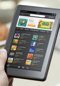
 Amazon reported record breaking Kindle sales this holiday season. The Kindle Fire was a major player in making those sales possible.
My sister got a Kindle Fire, so I thought I’d grab it and give my thoughts on it. First off, I was shocked at how small it is. It is not that much bigger than my Kindle Touch. I guess the size came as a shock because I’m used to the iPad.
The Kindle Fire is the best of two worlds. It is compact enough to tote around in your purse, but it yields a bigger screen than a smartphone. So, you don’t have to squint to see what you’re reading. Plus, there’s no data fee each month on top of the fact that the Fire is the same price as most smartphones with a contract.
The display is as crisp and vibrant as described in the product description. I like how some of the most prominent navigation buttons are bold or in a different color to make sure you don’t miss them.
Now, here’s where the Fire could use some improvement, and I have to say that I am biased because I am a staunch advocate for user friendly technology. The Kindle Fire is very appealing to the masses because of its price and features, which is Amazon’s goal. That sentiment can certainly be proved with the rush of new Kindle Fire owners this Christmas. However, there are a few aspects of it that make it counter intuitive.
The app wheel that spins the apps on the home screen is cool, and it allows you to quickly zoom into the app that you want. But, the home screen in general is a bit cluttered with apps and links. It took me awhile to figure out where I needed to go first. Learn how to open AAE file.
There is only one button that switches the tablet in and out of sleep mode. My first instinct was to find the physical “home” button, but that is actually on the screen in the bottom left corner.
As for the web browser, I like that the text does not require scrolling, and it reads down the page regardless of whether you flip the tablet vertically or horizontally. I am visually impaired, so I have to zoom in on the text that I am reading. I couldn’t find an easy way to do so in the Kindle Fire’s web browser. I also had a little trouble with the tabs. Learn how to open BUP file.
Accessibility is something that Apple excels at, and integrating it would take a little more effort on Amazon’s part. It would probably also ramp up the price because of the extra time. But to truly appeal to everyone, a device has to include features that make it usable for people who cannot access it the conventional way.
So, to sum it up, there are aspects of the Kindle Fire that are awesome, and there are others that need improvement. It is just like any other new technology that will improve over time. So for now, I am quite pleased with my Kindle Touch, and with my iPad for more heavy duty stuff.
So, new Kindle Fire users, what do you have to say about it?
For the web browser, did you try pinch zoom?
I love my Kindle Fire. I’m a Kindle owner since Gen 1. I still prefer long sessions of reading on my regular Kindle (gen 3) but the rest of the time I’m using the Fire. The games look great. I also use the Fire for knitting patterns (EZ Pdf reader is great for these)
I just got the Kindle Fire for Christmas. I do not have an Ipad, nor any of the other Kindles, although I do own an Iphone. That being said, I LOVE my Kindle Fire. I have not been able to put it down! I have already read several books, more than I would have had I not had digital access. I definitely will agree about the “Home” button. I instinctively hit the power switch all the time, thinking it will naturally take me back to the “Home” screen. I think the addition of a physical “Home” button would give the device more of a natural feel as most devices already are equipped with this feature. Overall, great product! I would give it 4.5 Stars!
It’s extremely easy to zoom. Zoom in is two fingers on the screen and slide them apart. Zoom out is slide the fingers toward each other.
Kim, I am also a long-time Kindle user & love it. I had the same idea about knitting/crochet patterns on the Fire. Also recipes. I have looked for an easel for the Fire, but haven’t seen one I like. My DIL got a Nook tablet for Christmas and an stand for it. I haven’t seen IRL yet, but it looks like the ideal stand for the above usage.
I don’t see how the Home button could be any worse that the very annoying 5-way button on the K3. I still miss the little joy stick button. It was so easy to move with just a fingernail.