Now that the Kindle Fire is out and making a splash on the tablet marketplace, a commonly heard description by people who aren’t trying to set it up as the next iPad is that it’s “Amazon’s newest, most advanced eReader”. Now, in the interest of complete honesty from the start I will admit that nothing has managed to compare to the experience of E Ink Pearl for me when it comes to reading. That doesn’t necessarily mean that the Kindle Fire is horrible for reading, just that for people who happen to have access to both technologies it will likely remain preferable to use the dedicated eReader.
What if you only want, or can only afford, to have one device on hand? The Kindle Fire will work just fine. Thanks to some of the options for display, it is almost pleasant to read even though it’s an LCD and there are some features that work even better with the tablet than they would on the admittedly slower eReaders. Moving from the Kindle 3, for example, to the Kindle Fire will require some adjustments, however, which it might help to be aware of.
Library
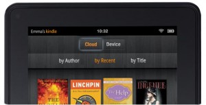
 Your books are now arranged a bit differently. Unlike on the other Kindles, which show you the books you actually have on your device unless you go out of your way to look at the “Archived Items” category, initially a Kindle Fire will display the Cloud view of your library. What this means is that every book you currently own through Amazon will be displayed, regardless of whether or not they have been downloaded. Kindle App users will likely be familiar with the concept. To download a particular book, just tap it. If you are interested in looking at only books that are already downloaded, though, such as in cases where WiFi is not available, there is a tab at the top of the screen called “Device”. This will narrow it down for you.
Reading
The Kindle Fire’s reading app is pretty nice, all things considered. Tapping the bottom of the screen will pull up a menu bar and slider. The slider allows navigation by location or percentage. The menu bar has the familiar “Aa” button that pulls up a Font Style tab to let you choose between all eight font sizes, three different options each for line spacing and margin width, and a few color schemes. Those first two will mostly be a matter of preference while the latter contains the vital “white text on black screen” option that most people will prefer for extended reading. This button will also pull up a tab for Typeface selection, of which the Kindle Fire has eight.
Interaction
Users of older Kindles will also be pleased to find how much easier it is to interact with the text. Just hold down on a word to select it or drag across an area to make a larger selection. The option will appear to highlight, annotate, or search based on that. The search can take place through Google, Wikipedia, or within the text itself.
Overall it’s unlikely you will run into many problems adjusting to the Kindle Fire. It might not be the perfect reading device, but it does the job better than most. Feel free to leave a note if you have any questions about adjustment I haven’t touched on. I’ll try to answer any questions that pop up.
Why will “most” people prefer white text on black screen? I find it almost unusable.
A Droyd,
Just the results of an informal poll. I asked around between about a dozen people I know who own the Kindle Fire so far. If you really do hate it, and if you don’t already have a huge locked library of Kindle books, you might actually want to try installing the Nook app. It gets around the brightness problem by letting you greatly reduce the backlighting rather than inverting the colors.
Hi…can you tell me if the kindle fire can be read in direct sunlight? I love to read outside but I am concerned seeing that someone said you can’t due to the lcd screen. Any help is appreciated.
Thanks