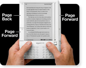
 As many of you will remember, the original Kindle design was a bit heavier, a bit clunkier, and had a small screen next to the main one for utility. Well, in 2006 Amazon(NASDAQ:AMZN) filed for a patent on the design. A mere four years later, it has been granted. At first glance, given how much the modern Kindle has evolved, this seems like it would be almost worthless. The text of the patent, however, gives rise to some concerns for the competition. The exact text includes this section:
“A handheld electronic device comprising: a first display for presenting visible representations of content, the first display comprising an electronic paper display; and a second display positioned alongside the first display, wherein the second display includes a plurality of graphic elements that correspond to portions of the first display, and wherein the second display is responsive to user input to one of the graphic elements to perform at least one action on content shown in a portion of the first display that corresponds to the one graphic element.”
This alone would seem to bode ill for fans of the Barnes & Noble(NYSE:BKS) nook if taken by itself, as many people reporting on this seem to be emphasizing. I’m admittedly a layman in patent interpretation, but with later sections indicating that “the second display includes a cursor that is positionable alongside the portions of the first display” and “the second display is responsive to tactile commands entered using a scroll wheel.”, it seems to me thatthe functionality is so clearly different that B&N has little to worry about. Still, will Amazon try to bring it to court and see what happens? We’ll have to wait and see.
Check out the Full Text of the Patent
I like the design of that keyboard better. As it is now, when I type on the kindle I have to change my positioning to reach the middle keys.