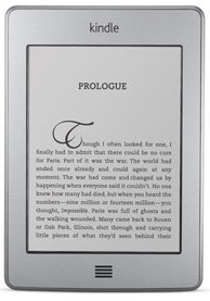
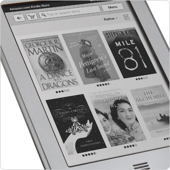
 As might be obvious based on the posted release dates at this point, it would be very unlikely for me to have a Kindle Touch handy to review right now. That’s OK! I won’t let anything as minor as that stop me. We already have some media to work with, and there’s a lot of information to be gleaned if you look for it.
The basics are still in place, of course. The display is the usual E INK Pearl screen technology that all current generation eReaders are pretty much required to have. The battery life is just as good as the Kindle 3 (or the Kindle Keyboard as we’re now supposed to refer to it I suppose) and will give users weeks or months between charges even during periods of heavy use. The connectivity includes built in WiFi and optional 3G coverage depending on which model you go with. Storage will remain more than sufficient for carrying a library worth of reading material while also allowing you to offload extra books to the Amazon servers. Whatever springs to mind when you think “Kindle” will probably be pretty accurate still.
There are obviously a few things that are new and unique to this Kindle family addition, though. The obvious one is the touch screen. It will be making use of the increasingly popular IR touch system also utilized by the competing Nook Simple Touch eReader. This avoids the problems that Sony had with their early touchscreen eReaders, where the extra layer required for the touchscreen reduced readability on the device. It also allows for the use of gloves, which many of you will be aware can be problematic on devices like the iPad unless you get specialty products to compensate.
Along with the new screen technology, Amazon has clearly sped up the refresh rate on the new Kindle. It is “optimized with proprietary waveform and font technology”, which I am taking to mean that they have worked out a process to absolutely minimize the refreshed area of the screen during each page turn. The extra speed is quite noticeable and again seems comparable to the Nook Simple Touch based on the currently available video footage.
The only other immediately obvious difference from the Kindle 3 is the physical presence of the device itself. The Kindle Touch is smaller, lighter, silver, and lacks any form of mechanical button. Everything is tied into the touchscreen, so there is no need for anything extraneous. While the new Kindle 4 without a touchscreen manages to be even smaller and lighter, this is a noticeable improvement over the Kindle 3 and will likely improve long-term reading experiences somewhat.
At a glance, this new addition to the product line is a perfect response to the competition. It is light, fast, attractive, and has a touchscreen display. I will admit that I wish there were physical page turn buttons as a matter of personal preference, but that’s hardly a deal breaking factor. Most of what makes it such an attractive deal, however, is how little they have had to change since the last Kindle. It seems to basically be a new screen on an old device.
In terms of functional differences in the software, we’re left without much right now. The EasyReach feature will partition off the screen in such a way as to make page turning more intuitive and less dependent on swiping than might otherwise be the case. That’s a nice addition.
There is also “X-Ray”. X-Ray is a feature that will allow users to quickly scan passages containing references to particular keywords while drawing upon information from Wikipedia and Shelfari. It is hard to anticipate exactly how well this will work in practice, but Amazon has proven fairly adept at making use of predictive algorithms. While I don’t believe they will be able to, as they claim, find “every important phrase in every book”, this could be a great reference tool.
 Annotation may also be significantly improved by the addition of the new input. Highlighting, placing the cursor, and generally navigating in small motions is problematic on the Kindle Keyboard’s 5-way controller. It isn’t bad, but it’s too slow to be used as extensively as some may want.
I would claim that the new personal library browsing has been improved by the inclusion of a cover display shelf type of interface, but I don’t really consider this a useful feature. While for some titles it is perfectly simple to pick out their cover from the crowd, many still have not been optimized for E INK’s monochrome displays. Even more problematic is the importing of titles from other sources. If the focus of the Kindle is really going to be the reading experience, highlighting the pretty pictures should not be a major sales point.
While this is only a minor hardware and firmware improvement over the last model and competing devices, it addresses demand and gives customers access to one of the cheapest, most useful eReaders available today. Keep in mind that the Kindle platform brings huge value to the table as well with the inclusion of Whispersync, library lending(yes I know it’s new and late in coming, but it’s definitely the easiest to use at the moment now that it’s here), cloud storage, and perhaps the most impressive eBook store currently open.
So, is this a better eReader than its main competition in the US? The Nook Simple Touch is the obvious point for general comparison. Barnes & Noble took everything they learned from the original Nook, copied a few more things from the Kindle, and created a really fine eReader. I would say that the playing field has tipped slightly in Amazon’s favor, though. Not necessarily because of the superior physical properties of the device, but because the Kindle Touch brings equivalent hardware to the table and leaves the Kindle’s superior software and content to win out. This isn’t to say that a major B&N update can’t change things, but for now they might have a problem with Amazon.
Will any of these software features make it onto the existing Kindles through a firmware update? I don’t think I’ve seen that mentioned anywhere.
Yeah I’d say the K3 would probably be neck-and-neck with the Nook in terms of hardware and user experience, although the Kindle 4 supports audio books, optional 3G connectivity, and basic web browsing (over wi-fi). So for that – it seems that Kindle is safely in the lead as the best product.
Of course – this may all change if B&N releases their next generation Nook within a few months (doubtful) in response. Because at the moment – I see very little reason why anyone would buy a Nook now over a Kindle, unless I don’t know, if they really wanted to read any book free for an hour inside their local B&N Brick and Mortar store?
But other than the minor (to most people – although to some potentially important) differences above – the devices are neck and neck. The real key is probably pricing. Amazon obviously has the much more aggressive approach to pricing, and it’ll be interesting to see if B&N will significantly drop the price on their Nook anytime soon.
While they haven’t said anything for sure just yet, I doubt it. I rather expect the Kindle Keyboard will be phased out in the next few months, both to avoid having to upgrade hardware to match the Kindle Touch and to keep down costs on the 3G browsing. You’ll notice that they did away with 3G internet use on the Kindle Touch unless you’re shopping.
I agree that Kindle Touch is better for reading experience but, the limit of 3G browsing confused me. An extra 50dollar for only portable Wiki? I don’t think so.
Totally agree on a personal level, Kyougaku. I wouldn’t be interested. For people without access to a reliable wireless network, though, it is the difference between a truly wireless device and another reason to stay tethered to your PC.