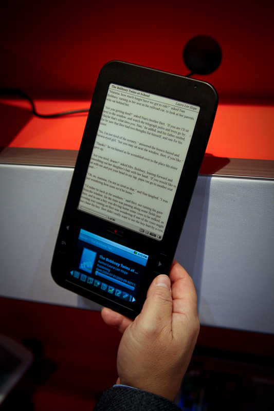
 SpringDesign wasn’t ready for a public show and tell when the Nook was announced. But due to the similarity between the two devices (and according to the Spring Design it is not coincidence), SpringDesign had to stick their neck out with an unfinished prototype. Now they finally have a finished version that can be played with and Pocket-lint got in some hands on time with it at this year’s CES. Of course, we all know that the CES 2010 almost had an entire section for eBook readers, there were just so many of them. Looks like everyone wants a piece of the Kindle pie! Apple included, if the rumors are anything to go by.
Coming back to the Alex, the first impression of the device is definitely its sleek looks. Looking at it in the profile really makes you appreciate how slim it is. Then you notice the LCD touchscreen. On the Nook, the secondary LCD touchscreen is barely a strip and is strictly meant for navigation. So to me it is more like a gimmick — watch your book covers in full color before beaming them up to the e-paper display. But on the Alex it is more like an iPhone sized screen. And with Android running in the background, it does have some exciting possibilities.
One thing that the Nook obviously has over the Alex is the massive support of the Barnes & Noble catalogue. With devices like this, at least at this moment, content can really make or break devices. The Nook would not have sold half as many units had it not been for the content that comes tied in with it. With that in mind, Alex’s $399 price tag sure sounds pricey compared to the Kindle and others. But given the extra functionality (almost everything Android does minus the GSM/CDMA bits) on a larger screen and a possible cut in prices when it goes into production, might see it catch on.