 We already know that Amazon intends for the Kindle Paperwhite to set the new standard for eReader hardware in every way they could manage. Some people might still wish for physical page turn buttons (I certainly do) but other than that it is a clear step ahead of all of the competition right now. That’s referring entirely to the US markets, of course, which may be a good reason that they have decided to update the Paperwhite firmware with some specific comic-related improvements in mind.
On a November 8th release, the new software improvements were made available for download. If you have a Paperwhite and haven’t gotten everything automatically delivered to your device at this point, check out the side-loading instructions located here.
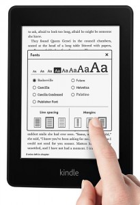
Foremost in the advertised improvements is the list of optimized fonts. Palatino, Baskerville, and Futura have all been made sharper and smoother. It’s a small thing in many ways, but the change will stand out for anybody who prefers to use these fonts regularly.
The ability to remove Recommended Content from your Paperwhite’s home screen is now also included. This has become a point of annoyance for many users, but the ability to remove this particular advertising stream was added not long ago to new Kindle Fire models and was inevitable here as well. A more interesting update would have been producing the same stream for older models on demand, honestly.
The settings menu has been brought to the front of things a bit more as well. You can now jump straight into this menu directly from the menu while reading a book with no need to return to the home screen.
Perhaps most importantly, given the recent push into Japan, is the improved manga/comic display capability. A new Fit-to-Screen option will stretch images to fill the entire screen, addressing many situations where small panels were practically unreadable previously.
The Paperwhite is also now able to retain a manga/comic specific setting for page refresh preferences that is completely separate from the same options for book reading. This makes it easier to choose the proper setting to maximize both battery life and reading quality in two areas with distinctly different visual representation needs.
In preparation for a move beyond Japan into China, Simplified Chinese is now included as a font option. It’s a small note now, but could be vital in the long run.
The only other really notable change is in book samples. When picking up the full version of a given book after reading the sample you will now start off at the last position accessed in the sample. The sample itself will be removed from the library. Organization will be greatly improved as a result for anybody who regularly samples their books. Learn how to open ICA file.
Many of these updates are small things, but added together they make for a great update. There is more than can and likely will be done to improve things, especially with regard to comic-reading. Now that we’re seeing a much bigger effort to get graphic storytelling into the Kindle marketplace, however, it’s safe to assume that a wider audience will demand attention and genre-specific features that will quickly optimize the eReaders as best a black and white display can be optimized.