Kindle Touch at a glance
In case you are in a hurry or are not interested in the in-depth technical stuff you can just read though this brief review to get a high level scoop on recently released Kindle Touch.
- Noticeably smaller than Kindle Keyboard (KK/K3) and 0.5oz lighter. Just a notch larger (hardly noticeable) than Kindle 4 Non-Touch (K4NT) and 1.7oz heaver.
- Exactly same eInk Pearl screen as in Kindle Keyboard and Kindle Non-Touch (verified with colorimeter). Unlike backlit screens of tablets, eInk reads like a paper, so it is very readable in direct sunlight. On the other hand you will need a light to read from Kindle when it is dark. Some options include leather cases with built in lights and clip-on lights. Touch works based on infrared sensors so nothing is overlayed on top of the screen preserving its contrast.
- Only two buttons: Power and “Home”. Everything else is controlled by multi-touch and gestures (including page turns)
- No computer required – books and audio books are downloaded directly to the device. However you can still connect Kindle Touch to computer to transfer books via USB cable in case you can’t or don’t want to use 3G or WiFi
- Long battery life of up to 2 months on a single charge.
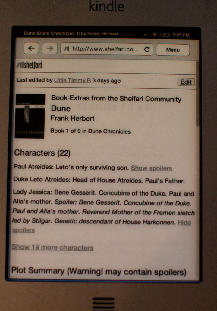
- WiFi only or 3G + WiFi connectivity available. However web-browsing of websites other than Wikipedia and Shelfari (Amazon’s free encyclopedia) only works though WiFi
- Text-to-speech can read your eBooks and (!!!) PDF documents to you via built-in speakers or headphones.
- Whispersync will automatically synchronize reading position between all your Kindle devices and apps so you can seamlessly read one book on many devices.
- Audiobooks from audible are downloadable directly from the Web and playable on Kindle. No computer required.
- Kindle Touch has a built-in MP3 player that can play music while you are reading books. Actually it can just play – you don’t have to read a book, unless you want to
- Built-in dictionary to look up definitions and translations of words in books and documents. You can also look up things in Wikipedia.
- Unicode support allows reading books in many languages, including Russian, Japanese, Chinese, Korean.
- X-ray feature allows you navigate characters and high-level concepts in a book
- Native support for PDF, MOBI, PRC, TXT and HTML. Other document types can be loaded onto Kindle via Amazon online conversion.
- Compared to previous Kindle versions PDF support has been improved.
- More than 1,000,000 in-copyright books available for purchase. Wast majority of these for $9.99 or less (including most of New York Times bestsellers). On top of these there are also around 2 million out of copyright books available for free.
- First chapters in any book are available to read as free samples.
- You can check out books from your local community library. For Amazon Prime subscribers it is also possible to loan books from Amazon library for unlimited time.
- Newspapers, magazines and blog subscriptions are automatically wirelessly delivered to Kindle Touch.
- 4 gigabytes of built-in flash memory can store up to 3,500 books at the same time.
- All eBooks that you buy from Amazon can be downloaded as many times as you like to your Kindle, PC, iOS, Android, Windows Phone 7 and other reading apps.
- Social features include Twitter and Facebook integration along with the ability to share book highlights and see passages that other people most frequently highlight in a book that you are reading.
- WebKit-based browser that can easily open complex web-applications such as GMail.
- 4 models to chose from:
- 3G + WiFi Kindle Touch – $189.00
- 3G + WiFi Kindle Touch with Special Offers – $149.00
- WiFi-Only Kindle Touch – $139.00
- WiFi-Only Kindle Touch with Special Offers – $99
- For pricing of other Kindle devices (keyboard and non-touch) see table in the left sidebar
Now lets take a deeper look at all o the aspects and features of Kindle Touch and how it compares to two other 6″ eInk devices – Kindle Keyboard (KK) and Kindle Non-Touch (KNT). I will refer and compare Kindle Touch (KT) a lot to these devices in the course of this review.
Kindle Touch Ergonomics
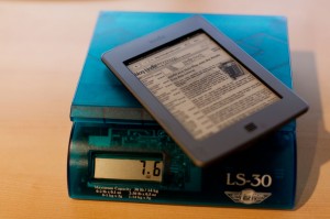
It is amazing how quickly we can become spoiled, especially when comparing things. Kindle 3 felt significantly lighter when compared to Kindle 2. Kindle 4 Non-touch felt like a feather compared to Kindle 3. As I hold all 3 current devices (Keyboard, Non-touch and Touch) and compare, I can clearly feel the difference in weight. Kindle Fire that also lays in front of me feels like a brick when compared to eInk devices. Yet the truth is that all 6″ eInk devices (and perhaps even 9.7 Kindle DX) are light enough not to bother you during prolonged reading. It takes reading for more than an hour on something as heavy as original iPad for my hand to go numb. According to Amazon Kindle Touch weights 7.8 with 3G modem and 7.5 without. My electronic scale actually put 3G version at 7.6oz. It seems like Amazon is systematically overstates weight of their devices starting from Kindle 3. To put this into perspective, Kindle Non-Touch weighs 5.9oz, and Kindle Keyboard – 8.5oz. Of course Sony PRS-350 is smaller and lighter still at 5.3oz but at a price of having a smaller screen.
Kindle Touch is just a notch larger (6.8″ x 4.7″ x x 0.40″) than it’s non-touch counterpart (6.5″ x 4.5″ x 0.34″) and smaller than Kindle Keyboard (7.5″ x 4.8″ x 0.34″). Weight and size difference can most likely be attributed to increased battery capacity.
As far as controls are concerned, 3 eInk Kindles have different control paradigms each of which has its pros and cons. Lets look at most typical eReader usage scenarios:
| Scenario | Kindle Touch | Kindle Keyboard | Kindle Non-Touch |
|---|---|---|---|
| Flipping pages | Touch page flipping area or swipe. Either forward or backward page turn can be accomplished one-handed. Excellent experience. | Press page turn button. You can page forward and backward one-handed. Excellent experience. | Same as Kindle Keyboard. Excellent experience. |
| Finding a book or location within a book by keywords | Couple of taps to open search box and then you can type on on-screen touch keyboard which is rather responsive. Couple more taps to select search context if needed. Two hands required. Good experience. | Just start typing on the physical keyboard. Search context easily selectable with 5-way controller. Two-handed operation. Best experience. | Invoke on-screen keyboard with physical button and “type” by selecting letters with 5-way controller. You can still use just one hand (though using two is more comfortable). Overall it is a slow and tedious process. |
| Look up word in a dictionary | Touch the word and hold for a short time. Can be one- or two-handed operation depending on where the word is on the page. Excellent experience. | Use 5-way controller to select the word on a page. Can require a lot of clicking. One-handed operation. Overall acceptable experience. | Use 5-way controller to select the word on a page. Can require a lot of clicking. Doing this one-handed is not as comfortable as with Kindle Keyboard because 5-way controller is located in the middle of the device. Overall acceptable experience but slightly less so than with Kindle Keyboard. |
| Look up word in Wikipedia or Google | There is no way to select a word or a phrase within a book to conduct a search. You need to type it on on-screen touch Keyboard. Less than optimal experience. Definitely two-handed | Select word or phrase with 5-way, then press “Space” on keyboard. Use 5-way to select search context. Acceptable experience. Can be done one-handed. Alternatively you can just type the word on keyboard. | Same as with Kindle Keyboard when it comes to selecting the word in a book, but instead of “Space” you need to press “Keyboard” button twice. Acceptable experience. |
| Navigate via table of contents | 3 taps to get to table of contents, then just tap on the chapter name to go there. Two-handed operation because 3 initial tap points are on top, bottom and center of the screen. Overall good experience | Use menu and 5-way controller to get to ToC and then 5-way controller to select an item. One-handed operation. ToC is easier to get to but harder to navigate with 5-way. Overall good experience. | Same as Kindle Keyboard but a bit more awkward because of central location of 5-way controller. |
| Highlight a passage / share on social | Tap, wait and drag to select the passage you want to highlight, then tap to confirm. Very convenient. Can be either one or two-handed operation depending where the passage is. | Use 5-way to select start and end of the passage to be highlighted. Acceptable experience | Same as Kindle Keyboard but a bit more awkward because of central location of 5-way controller. |
| Go to next/prev chapter | Swipe up to go to the next chapter, swipe down to go back to the previous one. Can be done with one hand. Excellent easy experience. | Use left or right on the 5-way controller. Easy one-handed experience. | Same as Kindle Keyboard but a bit more awkward because of central location of 5-way controller. |
As you can see, the most frequent operation of flipping a book page is equally comfortable on all devices. In other operations, touch and keyboard perform on par with each other. So it’s really a question of what you will do more often. If English is a second language for you and you will frequent the dictionary than touch will have an advantage. If you annotate with text a lot, then keyboard rules the day. Non-touch device will give you some minor trouble even in such basic operations like finding a book by name (among 100s of other books in your archived items) but it pays back for this inconvenience in reduced size and weight.
As with Sony devices that pioneered eInk + touchscreen combo, there is a noticeable lag between finger manipulations and things happening on the screen. At first it seemed a little annoying to me but very soon I got used to it and stopped noticing it altogether. The convenience of selecting any word on the page by merely pointing at it is worth it.
Kindle Touch Screen
The screen in new Kindle Touch is the same eInk Pearl that Amazon has been using since Kindle 3. It is also currently used by Sony and Barnes & Noble in their PRS and Nook devices. It features resolution of 600 x 800 pixels and can display 16 shades of gray. It has higher contrast compared to older generations of eInk and quicker refresh time.
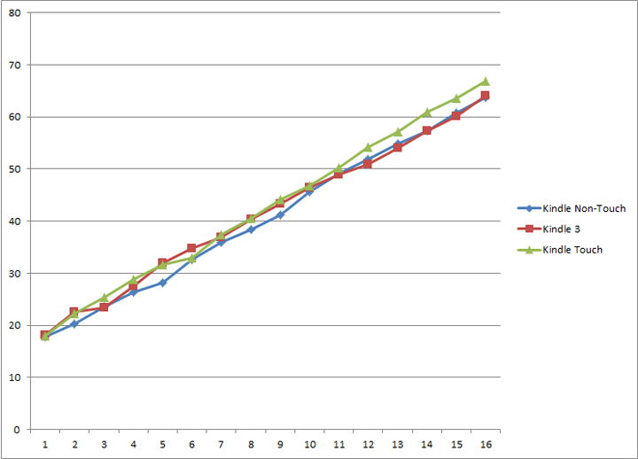
Although some people on forums claim that screens look different, I tend to disagree. I’ve measured all 3 screens with colorimeter that is normally used for printer calibration and found the measurements to be close enough. Small discrepancies can be attributed to normal screen quality variance, different screen age and wear and minor measurement errors. The difference is so small that it wouldn’t be noticeable to a naked eye. This graph shows measurements of the L component of Lab color for 16 shades of gray, with “0” being total black and “15” being “total white”. “L” component is indicative of the brightness and disregards color information. “a” and “b” components were close to zero indicating almost neutral gray color with a slight greenish tint.
Touch interface is implemented by infrared sensors located on the edges of the screen. This way nothing is overlayed on top of eInk avoiding low-contrast disaster that resistive tochscreen film caused in Sony PRS-600. IR touchscreen attributes to a slightly thicker bezel around the screen. I’m guessing that to conserve battery power, IR transmitters light up only few times a second until user touch is detected and then sampling frequency is increased. This can explain why there is a lag that is longer that can be attributed to eInk refresh speed and why very quick taps on the screen can be ignored by the device altogether (though not always).
Although if you rotate your Kindle around you can find an angle at which fingerprints will be clearly visible, they are not during normal reading. So this is not a problem (for me at least)
All-in-all eInk + Touch combo is not perfect but it does provide added convenience over keyboard and even more so over the lack of keyboard in non-touch version.
Kindle Touch Battery
Given my past experience with Kindle 4 dis-assembly (and how it turned out to be irreversible) I’m going to put off taking Kindle Touch apart to see what is inside, including the battery. Based on the device weight and claimed battery life, I’m guessing that it would have the same capacity as in Kindle Keyboard or more to accommodate for infrared touch screen power use. However I suspect that it might be of the same soft-case, glued-in non-replaceable kind as in Kindle 4 Non-Touch. My second Kindle Touch is scheduled to arrive on November 22nd and then we’ll know.
Kindle Touch Fonts
Just as in Kindle 3, Kindle Touch features unicode font support enabling users to read texts in non-latin languages such as Russian, Japanese, Chinese, Korean, etc. No hacks are required. I did some quick tests and confirmed that Russian and Japanese Hiragana definitely work. If the language you need is not supported you can always bypass this limitation by saving the document as PDF that has all of the fonts embedded.
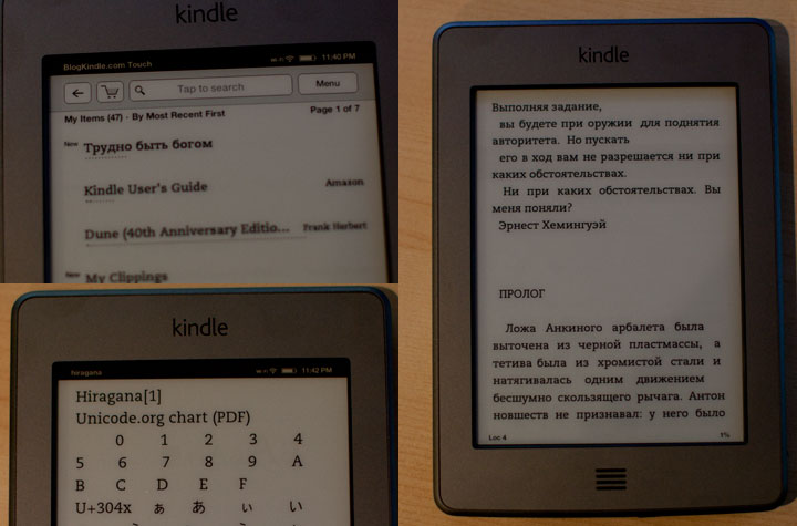
When reading books, Kindle Touch allows you to configure the font. You can select from:
- 3 typefaces: regular, condensed and sans-serif
- 8 font sizes that can be configured wither via fonts dialog or just by doing an pinch-zoom
- 3 settings or line spacing
- 3 settings of line width (called “words per line”)
Kindle Touch Software
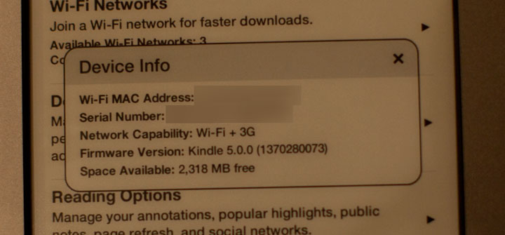
According to “Device Info” section in “Settings” my Kindle Touch currently runs software version 5.0.0 (1370280073). Kindle Keyboard currently has software version 3.3, and Kindle Non-Touch has 4.0.1. While there is little in terms of visible differences between 3.x and 4.x branches of Kindle firmware, unsurprisingly version 5.x looks like a major overhaul since it had to accommodate a whole new paradigm of touch interface. But changes in the software go beyond just touch. Some existing features were changed and several new ones were added. Here’s a scoop of what I’ve found so far:
- Table of Contents (both structural and in-text) now works in PDF
- Text-to-speech now works in PDF too.
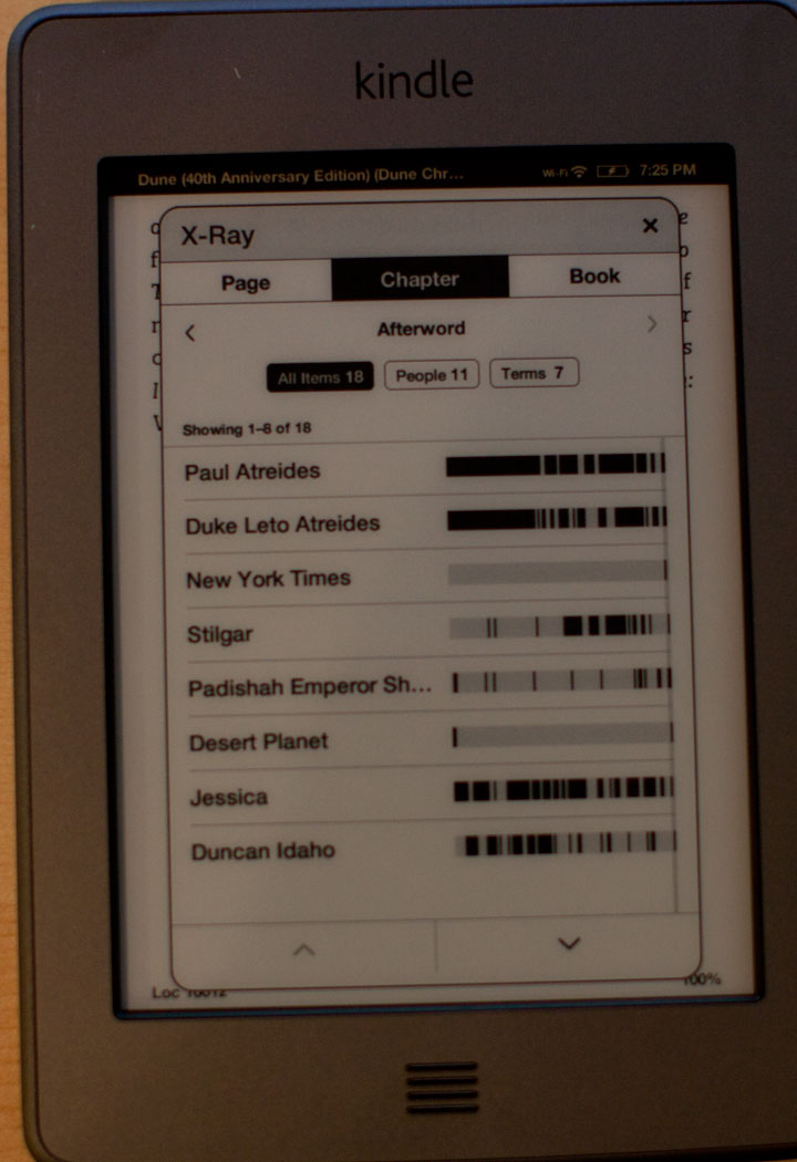
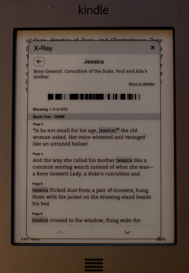
- X-ray book rich information system. Lets you browse characters and high-level concepts found in the book. At the moment this feature is enabled for only a small fraction of Kindle eBooks
- Only portrait orientation is currently available for reading book or viewing PDF files. There are claims on message boards that landscape may be enabled via future software update
- MP3 player got a face-lift. In Kindle 2 and Kindle 3 you could only use hot-keys to start or pause it and advance to the next track. There was no way to go back. In Kindle Touch MP3 player controls are visible in book menu. You can play/pause, go back and forth between music tracks and control volume all with touch. Unfortunately there is still no artist/album navigation
- Audiobook player takes advantage of touch so you can easily jump to any location within the book
- Settings page was reworked and made more organized
- You can configure Kindle to do a full page refresh after each page turn to eliminate ghosting. By default this happens after every 6 page turns.
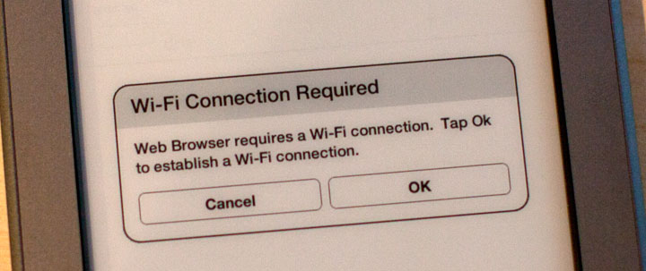
- Web-browser can access websites other than Wikipedia and Shelfari only when you are connected to WiFi (not via 3G). On the other hand you can access AT&T hotspots in the US for free.
Kindle Touch PDF support
One of the areas that was reworked in Kindle Touch is PDF file support.
Kindle finally added support for internal and external PDF hyperlinks. So things that were clickable in Adobe Acrobat Reader on PC are now clickable on Kindle. PDF documents became much easier to navigate. Another welcome addition was added support for structured table of contents that Adobe Acrobat normally displayed as a “tree-structure” to the left of the document. Kindle displays it as a flat menu. Again it makes documents easier to navigate. In the past one had to rely on search or “go to page…” command.
These commands are still there and work well.
Text-to-speech now works in PDF documents too.
Unfortunately landscape viewing mode is no longer there which makes documents that were designed to A4 or US Letter paper size very hard or impossible to read without zooming. Pan and zoom is controlled by multi-touch as one would expect, but it is not as convenient as switching your 6″ Kindle into landscape mode and paging though the document. With Kindle Touch, once you zoom in, you loose the ability to flip pages (need to zoom all the way out first). Panningg is reasonably fast due to the fact that the viewer updates only half of the pixels on screen and even those in 2-color mode. Once you stop panning a full page refresh follows to eliminate ghosting and display the image in full quality.
Found in UR, Frank Herbert’s Dune (though not “Dune’s Messiah”).
Kindle Touch X-ray
This was one of the highly-advertised features during the Kindle Touch reveal back in September. It lets you browse though characters and concepts in the book and see where they are mentioned. The feature is based on shelfari Amazon community encyclopedia. Currently it is only available in a very limited selection of books. After randomly checking a few dozen of books in my Kindle library I found it working in Stephen King’s “UR” (that was written specifically for Kindle) and Frank Herbert’s “Dune”. What is interesting that it didn’t work in “Dune’s Messiah” which is a sequel. I found it funny that one of the entities in the “Dune” book was “New York Times” due to the fact that it was mentioned in the afterword. While technically this is correct, it is a bit misleading.
…
…
…
Kindle Touch Apps
Kindle has supported apps for quite a while. With introduction of Kindle Non-Touch and Kindle Touch, application market has split. Since Kindle Keyboard has been around the longest, most if not all Kindle apps work on that device. On the other hand, most currently do not work on Keyboardless devices due to poor user experience or complete inability to control the app without keyboard shortcuts.
So each individual app may or may not run on every type of Kindle device. With time app developers will update their apps to support as broad range of devices as possible buy meanwhile you can enjoy playing Number Slide on Kindle Touch.
Other small Kindle Touch Features
- Magazine reading layout was reworked to be more touch friendly and efficient. Font page now features 4 main articles chosen from different section. Either of these can be selected with a single tap.
- Surprisingly Kindle Touch doesn’t take advantage of pinch zoom to view images within eBooks. You can maximize images for full-screen viewing but can’t zoom in to a specific part of the image
- When content is downloaded you can see completion percentage ticking in real-time. It can be helpful if you are downloading something like 20 hours unabridged version of Tom Clancy’s “Dead or Alive” audiobook.
- Although officially Amazon is mum on HTML support, it is present. If you save HTML with file extension TXT into the documents folder, Kindle will open it and basic markup, formatting and hyperlinks will work.
Conclusion
All-in-all, Kindle Touch is another solid eReading device from Amazon. Although previous incarnations of Kindle were already quite good at their main purpose, which is reading books and newspapers. That being said, touchscreen interface still does add some value even if to keep the device usable while making it smaller and lighter. As I was typing this review (more than 3000 words as it turned out), 23 user reviews were already posted on Amazon, more than half of them are 5-star reviews.
With purchase price of $99 (though I’d recommend making a one-time $50 investment to get lifetime free 3G) Kindle Touch provides great value (especially considering the ability to get books for free from library (either your local one or Amazon Prime). If you will find sponsored screensavers annoying, you can always pay $30 that you saved during the initial purchase to amazon to have them removed.
Thanks for the review. It is the best kindle touch review I have read so far, and the only one to mention small but important details missed by all the other reviewers. If you find out more about the horizontal orientation software update, it will be helpful updating the review.
It would be nice if you explained what the values on the X and Y axes are on your chart. It is clear that whatever you are measuring, there is little difference between the three models, but we have no way to tell what is so similar between them.
Thanks for the review, appreciated.
I think it’s a shame Amazon left out the physical buttons for flipping pages. Isn’t it next to impossible to turn pages forward when holding the Kindle in your left hand (and vice versa)?
According to Amazon, HTML is not supported natively, but through conversion.
WarStreet,
I’ll keep updating this review as more information comes into light. I’ve already did some updates – see below.
loximuthal,
The graph shows “L” component from Lab color space of 16 shades of gray displayed on the Kindle screen and numbered from 0 to 15 (black to white). I’ve updated the corresponding section of the review.
Nicolai,
If you use swipe gesture to flip pages, you can easily turn pages forward and backward regardless of which hand you hold you Kindle in. Swiping up and down will navigate book chapters.
tlc,
Officially yes. But in reality if you put HTML file with TXT file extension in the documents folder, it will display. Basic markup and formatting (bold, italic, underline, etc) works, complex stuff like Javascript (though Kindle web-browser supports it on Internet web-pages) does not.
If you have more questions – be sure to leave a comment
Andrei – I can’t thank you enough for this review of the Kindle Touch. I was trying to decide on whether or not to replace my Mother’s curent K2 with the Touch. She loves to read the Bible but she finds it difficult to navigate between different chapters on her K2. I thought the Kindle Touch might allow her to more easily navigate between chapters and verses over the K2. Your review on how easy it is to navigate within the content really helped me. Great review.
Andrei, I think that it’s a real shame that there’s no screen rotation for pdf’s on the kindle touch, How could they leave something so basic out? my question is what are the odds that they might add this through an update or something in the future? seems to me this is a glaring hole…
btw, this is the best kindle touch review online so far.
DSC,
Thank you for the compliment.
As far as software update with landscape is concerned – hard to tell. People have been asking for a way to organize books on Kindle and… after years of asking we got collections.
It is possible that Amazon will implement it, though it might not be an easy fix since they will need to be sure that it doesn’t break anything.
If everyone interested in this feature would get on the phone with Kindle support and let them know that landscape is needed – it might help. Certainly it wouldn’t hurt
Nice review. I have a K3, so I think the disappointment in the lack of landscape is the fact that it was there on previous devices. All I can figure is that the logistics of the touch screen makes landscape difficult (although Android Smartphones have figured it out).
Well, I might get one for my mother anyway. She wouldn’t miss Landscape (especially since she wouldn’t know what he is missing), and other little challenges wouldn’t matter anyway. Thanks for the review.
HTML can’t be read as a document format without conversion. You can’t load an html document to your machine and read it. It will only read web pages on websites.
Scott,
try renaming HTML file to *.txt, putting it into the documents folder on your Kindle and opening it.
This is actually the first review where I think the reviewer actually used a kindle before.
The tech world has really lost the ability to do real reviews ever since Byte died.
So I have to buy and make my own (for the $79)
http://tswe.blogspot.com/2011/11/79-kindle-hands-on.html
I just purchased my Kindle Touch Today. And after 6 weeks with k4 it feels so damn heavy.
Also I am pretty sure that the Kindle touch is a total software rewrite from top to bottom.
If they were updating the software of K3 why not have buttons as well as touch which
would have been unstoppable.
I think it might even be an version of andriod and the browser might be silk.
First the interaction is MUCH slower than the k4 ($79). No landscape mode.
No volume button on side, web browser is different (it allow target new/top) for pop
up windows which replace the current one, while the K4-79 does not.
Anyway I have only had mine for 8 hours (got at lunch while at work) I will try to
remember to post link here when I have my analysis ready.
I have noticed that your screen-shots have lots of ghosting. check the second x-ray page, it has the ghosting of the previous page. I am asking since there are tons of reports about ghosting and I was thinking that these might be just a bad batch, otherwise reviewers would have mentioned it. But coming back here I am afraid it is a common problem and that not everyone is noticing it. Can you say more about ghosting ?
WarStreet,
The ghosting is an anticipated side effect of the way Amazon decided to speed up the page refresh rate and improve battery life. It will only refresh fully once every 6 page turns, which means that depending on the density of the text, lighting, and a couple other factors, there is a good chance that some will be noticeable.
The fortunate thing is that you can turn it off. It’s just a quick, easy menu option and then you never have to worry about it again. You’ll get a more noticeable page refresh each time, but not many people complain about that after having used a Kindle for a while anyway.
I’ve spent a good week or so with the Kindle Touch and would offer my opinions here.
The Touch out of the box feels winning. My first impression was positive overall, lightweight (same feel as my Kindle Keyboard), smaller by nearly an inch in its footprint, and understated with just a single button on its front surface– almost Apple-like.
I loaded the KT up with books and kicked the tires. Here’s where I found rough patches.
The 6-page refresh caused so much distracting ghosting, it was the first ‘feature’ I turned off. What I champion about e-ink readers is their paper-like appearance. The ghosting induced by the lack of refresh takes that advantage right off the table, turning the appearance to that of smudgy ink.
After clearing up the display (Thank You Amazon for allowing a software switch) my attentions turned to its thickness. The KT is remarkably thicker than the KK. Looking at the design, I’m not sure why. The screen is deeply inset from the bezel– by about an eighth of an inch. In sunlight it casts an odd shadow on the edges of the screen. My only guess is the engineers were worried about accidental touches and wanted to provide a degree of offset. But in function– this inset is far too deep. It causes questionable touches (wait– did I touch the screen or not?).
The touch screen itself has some issues. Sometimes there is a lag between touch and turn– causing me to touch again- then the book advances 2 pages instead of one and I have to skip back. This is maybe my biggest gripe about the device.
It’s also not clear at which point the left side leaves off from the right touch area. Sometimes you miss the target zone on either side. At one point I brushed on a turn and jumped to the chapter break. This touch screen leaves something to be desired, and the addition of page turn buttons would have been welcome here.
I’d also like to address the bezel. Silver is not a great choice for a bezel with a white screen. The screen gets a little lost in the bezel compared to the darker gray KK and the black of the Nook. The arrangement of the screen within the device isn’t ideal, either. The screen is perfectly centered on the device– but this leaves a larger bezel on the top and bottom than its sides. A more aesthetically pleasing option would have been to equal the bezel on top and sides, leaving a larger bezel on the bottom. While on the bezel– it’s a bit sharp as it turns down toward the screen. I think over time, I may develop a callous on my thumb– that edge should be rounded off. The more I consider it- the striped home button is out of left field. It appears as if its lifted off of some foreign device and doest belong here. While not a deal breaker, it shows that Amazon has something to learn in industrial design.
The power button on the bottom is now a push button rather than a slider. I have mistakenly powered the device off a few times. Move the power to the top or reinstate the slider. The current arrangement doesn’t work well.
I rarely read on my Kindle Keyboard without the case, and without a case with a built in light, I felt comparisons weren’t really fair. However on Tuesday my lit case showed up in my mailbox and I could better make comparisons between the two devices.
First– a big kudos to Amazon on the re-designed light. No longer sliding out from the upper corner- it now swings out on a hinge. An elegant solution. My only slight complaint is the shade on the LED should be a bit bigger, so you don’t get an eyeful of lamp when you rotate the device. The power hinge clip is gone in favor of contacts on the back. This too is an improvement. Thankfully, the case insets the power button on the bottom, so I can’t bump it quite so easily.
The feel of the case is strange. It’s leather, but feels like plastic. Hopefully Amazon will offer choices down the road. It looks good, but feels cheap and slippery.
After a week with this Kindle Touch, I’m finding myself drifting back toward the Kindle Keyboard more and more. The lack of folders (collections) is a real problem for me. The touch screen is dicey. And I really have issues with the inset screen.
I will continue using both for now– but Barnes and Noble discounted their Nook to $79 dollars on black Friday and I bought one. I much prefer the feel of the Nook to the new Kindle, and appreciate the additional font choices– but the lack of a lit case may be a deal breaker. I don’t want to carry a light around with me.
Hope you appreciated this road test. I think in the end I will wind up where I started– my Kindle Keyboard.
I had a K3 until a few months ago when I lost it. I’ve been waiting for the new Kindles and am pretty sure I will get the Touch. The only thing I didn’t like about the K3 was the Clipping function, because clipped material was saved as a text file in which almost all formatting was lost. Has this been improved in the the Touch? Can you clip and save as a PDF file? Thanks.
I am getting different answers on the 3G and what I can do online. When I am using the 3G online service can I search thru all of Amazon.com or only look for ebooks? Can I pull up my email using the 3G to connect or is this only allowed when on the wi-fi?? Sometimes when I am out shopping before I buy a hard copy of a book I will pull it up on Amazon.com to see what it is selling for online, so this is an important use to me. I cannot always count on having wi-fi available. I do not have a smartphone either.
Carol W.,
I don’t currently have a Kindle Touch with me to double-check this on (traveling for the holidays), but I am fairly sure that you are only able to search the Kindle Store and Wikipedia on the Kindle Touch’s 3G. The Email will definitely only work on the WiFi.
If you want more open access, Amazon has not yet restricted the 3G access on the Kindle Keyboard. For many people, this is still the ideal eReader and it is every bit as easy to use as the Touch. Just not quite as quick and no X-Ray.
I love how the Kindle touch has the x-ray and automatic dictionary lookup features. The Kindle touch is also quicker and has more access to the WiFi world. Also, I too like the redesigned light. I’d like to see Kindle touches in the hands of every student in the classrooms. The government should fund such an endeavor. Thanks for the article.